


Our Client
We had the fortune of working with Skamania County for many years, spanning from 2007 through 2015, developing the initial logo, websites with annual updates, tee-shirts, and all marketing materials.
Our Process
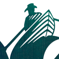
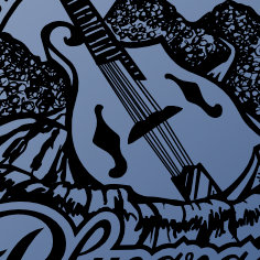
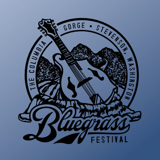
The logo started it all. It began as a happy accident involving a quick sketch at our initial briefing of a bass floating down a rushing river. That bass ultimately became a mandolin. We provided countless alternatives, but the first idea, in rare fashion, turned out to be the best.
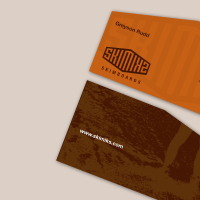
The visual started with a campy cutout and texture collage dirty with wear and "old timeiness", using Parcel as our typeface to match the logo.
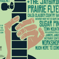
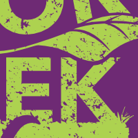
For the years to follow, we used a Saul Bass inspired illustration of a brown hand playing a banjo, with much more emphasis on the text, which shifted to Chinese Rocks, the typeface that would be synonymous with the event thereafter. The tee-shirts would ultimately sell out for several years.
Eventually, we used a "peeking from the forest" view of the festival, involving 3 instruments reflected in the moonlight, whose reflection was shaped as square dancers.
Our Gratitude
Our clients gave us virtually a clean slate, and the projects were liberating. Our body of work with Skamania County grew to include design for the Skamania County fair logo and tee-shirts. We are proud of our work with the festival and the county, and we cherish the friendships that we made in the process.